CSS BALLS
July 05, 2013 – http://hop.ie/blog/balls/
Flat design
There are two ways we could approach making spheres with CSS.
One is to create an actual 3D sphere using lots of elements. There are somebeautiful examples of these. A potential downside though is that these require the browser display many elements, which can impact performance. They also tend to look a bit rough as a smooth sphere would require many elements.
Instead of this I’ll try a second approach, making use of CSS gradients to add shading and create the 3D effect on a single element.
Demo and source code
All the examples mentioned can be found via my Codepen account, or by selecting the “Edit on Codepen” links in each example below.
Basic shape
Before adding details, we’ll create the initial circle shape. Begin with the HTML:
<figure class="circle"></figure>We’re using an figure element here, but it could be any element. Figure is an element used in HTML5 to represent an image or diagram that is a part of the content that could be removed without affecting the content’s meaning.
To create a circle from this figure element, I’ll give it a width and height, and a border radius of 50%. Anything over 50% will result in a fully rounded corner.
.circle {
  display: block;
  background: black;
  border-radius: 50%;
  height: 300px;
  width: 300px;
  margin: 0;
}
Hey presto, a wild circle appears.
Now that we have a basic circle, we can start to style it up into something more spherical.
Shading 101
The first thing most 3D-sphere tutorials do is add a single radial gradient, slight up and to the left of the center of a circle.
We can do this using the following CSS:
.circle {
  display: block;
  background: black;
  border-radius: 50%;
  height: 300px;
  width: 300px;
  margin: 0;
  background: -webkit-radial-gradient(100px 100px, circle, #5cabff, #000);
  background: -moz-radial-gradient(100px 100px, circle, #5cabff, #000);
  background: radial-gradient(100px 100px, circle, #5cabff, #000);
}
You should get something like this:
Radial gradients
The radial-gradient property takes a few arguments. The first is the center position for the start of the gradient. Then, the type of shape (circle, or ellipse) is specified. Lastly a series of colours is specified. You can specify more than two colours, but it is then necessary to include a distance with each one so that the gradient knows when to blend each colour into the next.
In this example just two colours are specified. This lets the browser assumes the first is 0% and the latter is 100%, and it draws the gradient between these to colours. If we wanted other steps in the gradient, we could specify distances in pixels or percentages, as you’ll see later.
So we have something that looks a bit 3D-ish. It’s ok, but let’s try to make it look a bit nicer.
Shadows & 3D
Depending on what sort shading you apply to the surface, you can create different looking spheres. First though let’s set up a scene to place the ball in.
The HTML we’ll use for this has a couple more elements:
<section class="stage">
  <figure class="ball"><span class="shadow"></span></figure>
</section>
The “ball” element has been given a span which we’ll use to create a shadow, and it has been wrapped in a stage div. The stage div is useful when we want to set some perspective and position the shadow, making it look more 3D.
Apply some styles to the stage and position a shadow to set the scene.
.stage {
  width: 300px;
  height: 300px;
  display: inline-block;
  margin: 20px;
  -webkit-perspective: 1200px;
  -webkit-perspective-origin: 50% 50%;
}
.ball .shadow {
  position: absolute;
  width: 100%;
  height: 100%;
  background: -webkit-radial-gradient(50% 50%, circle, rgba(0, 0, 0, 0.4), rgba(0, 0, 0, 0.1) 40%, rgba(0, 0, 0, 0) 50%);
  -webkit-transform: rotateX(90deg) translateZ(-150px);
  z-index: -1;
}
Note that I’m only including the -webkit perspective in the CSS. The Codepen examples contain fully prefixed CSS. In the above I set up the stage div to have perspective of 1,200 pixels. The perspective property is like the vanishing point in a 3D scene.
The ball’s shadow is then placed by giving it a radial gradient, but then positioning it using a transform. Transforms in CSS let you rotate, scale, move or skew things in a 3D space. The shadow is rotated 90 degrees on the X axis, and then is pulled down 150 pixels to the base of the ball.
Since we established a perspective value on the stage container, we end up looking down on it and can see it as a stretched oval shape.
It’s starting to look a bit better now. Let’s add more shading to the ball itself.
Multiple shaders
Very rarely in the real world would you find objects lit from just one angle. Surfaces reflect light onto other surfaces and the end results in various light sources mixed together. To create a more realistic looking ball, we’ll make it look light there are two light sources by using a pseudo-selector to add two gradients.
.ball {
  display: inline-block;
  width: 100%;
  height: 100%;
  margin: 0;
  border-radius: 50%;
  position: relative;
  background: -webkit-radial-gradient(50% 120%, circle cover, #81e8f6, #76deef 10%, #055194 80%, #062745 100%);
  );
}
.ball:before {
  content: "";
  position: absolute;
  top: 1%;
  left: 5%;
  width: 90%;
  height: 90%;
  border-radius: 50%;
  background: -webkit-radial-gradient(50% 0px, circle, #ffffff, rgba(255, 255, 255, 0) 58%);
  -webkit-filter: blur(5px);
  z-index: 2;
}
As usual I’ve only incuded the -webkit version for reference. Here we have two slightly more complex gradients.
The first gradient is a subtle under-lighting effect and it applied to the ballelement. The center of the gradient is positioned half-way across and at 120% of the ball’s height. This places the center off the ball’s surface. I did this so that the sharp ending colour wasn’t visible, resulting in a smoother gradient.
The second gradient is a highlight, placed at the top. It’s set to be 90% of the ball’s width and 90% of its height. The gradient is centered at the top so that it fades out at around halfway down the ball.
I’ve used the before pseudo-selector rather than create a new element to contain the shading.
Since this highlight gradient has a sharp edge, I’ve made of the webkit-only blur effect to soften the highlight. Unfortunately this is currently only a webkit feature (Chrome and Safari) but it may be more useful in future across other browsers.
Both gradients combine to create a much nicer effect:
Shinier
The effect so far is quite soft, so let’s add some shine and create something more like a snooker ball.
To achieve this we’ll make use of a soft under light as before, but adjust the top highlight to be smaller and sharper. We’ll need to make use of two psuedo-selectors to contain the ball’s colour, a bottom highlight and a reflection.
.ball {
  display: inline-block;
  width: 100%;
  height: 100%;
  margin: 0;
  border-radius: 50%;
  position: relative;
  background: -webkit-radial-gradient(50% 120%, circle cover, #323232, #0a0a0a 80%, #000000 100%);
}
.ball:before {
  content: "";
  position: absolute;
  background: -webkit-radial-gradient(50% 120%, circle cover, rgba(255, 255, 255, 0.5), rgba(255, 255, 255, 0) 70%);
  border-radius: 50%;
  bottom: 2.5%;
  left: 5%;
  opacity: 0.6;
  height: 100%;
  width: 90%;
  -webkit-filter: blur(5px);
  z-index: 2;
}
.ball:after {
  content: "";
  width: 100%;
  height: 100%;
  position: absolute;
  top: 5%;
  left: 10%;
  border-radius: 50%;
  background: -webkit-radial-gradient(50% 50%, circle cover, rgba(255, 255, 255, 0.8), rgba(255, 255, 255, 0.8) 14%, rgba(255, 255, 255, 0) 24%);
  -webkit-transform: translateX(-80px) translateY(-90px) skewX(-20deg);
  -webkit-filter: blur(10px);
}
Here we have the initial colour being applied as a subtle gradient on the ball itself. The before pseudo-selector contains a lighter highlight, which again starts at the bottom of the ball and creates the effect of reflected light from the surface.
The new addition here is the after psuedo-selector. It contains a circular gradient that starts almost opaque white at the center, and fades to transparent at around the 24% mark. This creates a white shiny effect, but to make it look like it’s reflecting off a three dimensional object, we apply a CSS transform.
The transform moves the shine effect left 80 pixels then up 90 pixels, and to adds a skew effect. The skew effect stretches the circle along the X-axis, so that it looks more like the sheen you’d find on a shiny ball.
8-ball
While we’re making a pool ball, let’s go the extra step and add the number 8.
We’ll need an extra element to contain the 8, as well as some styles to place it on the ball.
<section class="stage">
  <figure class="ball">
    <span class="shadow"></span>
    <span class="eight"></span>
  </figure>
</section>

.ball .eight {
  width: 110px;
  height: 110px;
  margin: 30%;
  background: white;
  border-radius: 50%;
  -webkit-transform: translateX(68px) translateY(-60px) skewX(15deg) skewY(2deg);
  position: absolute;
}
.ball .eight:before {
  content: "8";
  display: block;
  position: absolute;
  text-align: center;
  height: 80px;
  width: 100px;
  left: 50px;
  margin-left: -40px;
  top: 44px;
  margin-top: -40px;
  color: black;
  font-family: Arial;
  font-size: 90px;
  line-height: 104px;
}
The 100% border radius is again used to create a circle, and this circle is positioned at the top right using the transform property. Rather that put the number 8 into the content, I’m using the before psuedo-selector to add the content via CSS, and then skewing the number in a similar way to the containing circle.
The result is a shiny 8-ball.
Got my eye on you
One of the great things about CSS transforms is that they can be animated. Using CSS keyframes for animation, you can describe a series of transforms as an animation and apply that to an element. To show this, I’ll create and animate an eyeball.
First step is to adjust some of the colours use in the 8-ball example. A few tweaks and it’s looking a lot more like an eye. First, the HTML:
<section class="stage">
  <figure class="ball">
    <span class="shadow"></span>
    <span class="iris"></span>
  </figure>
</section>
The bulk of the CSS is similar to the 8-ball, with the exception of the iris and pupil parts.
.iris {
  width: 40%;
  height: 40%;
  margin: 30%;
  border-radius: 50%;
  background: -webkit-radial-gradient(50% 50%, circle cover, #208ab4 0%, #6fbfff 30%, #4381b2 100%);
  -webkit-transform: translateX(68px) translateY(-60px) skewX(15deg) skewY(2deg);
  position: absolute;
  -webkit-animation: move-eye-skew 5s ease-out infinite;
}
.iris:before {
  content: "";
  display: block;
  position: absolute;
  width: 37.5%;
  height: 37.5%;
  border-radius: 50%;
  top: 31.25%;
  left: 31.25%;
  background: black;
}
.iris:after {
  content: "";
  display: block;
  position: absolute;
  width: 31.25%;
  height: 31.25%;
  border-radius: 50%;
  top: 18.75%;
  left: 18.75%;
  background: rgba(255, 255, 255, 0.2);
}
A blue gradient forms the coloured part of the iris, and then the pupil and a highlight are created as pseudo-selectors. I’ve also added the animation property to the iris element. Animations are attached to elements using a format like this:
animation: animation-name 5s ease-out infinite;In this case we’d be applying an animation called “animation-name”, setting it to last 5 seconds, loop indefinitely, and applying an easing value of “ease-out”. Ease-out is when the animation slows down as it reaches the end, creating a more natural effect.
Without the animation yet created, we have a very static eyeball.
Lets create some keyframes to describe how the eyeball should move.
@-webkit-keyframes move-eye-skew {
  0% {
    -webkit-transform: none;
  }
  20% {
    -webkit-transform: translateX(-68px) translateY(30px) skewX(15deg) skewY(-10deg) scale(0.95);
  }
  25%, 44% {
    -webkit-transform: none;
  }
  50%, 60% {
    -webkit-transform: translateX(68px) translateY(-40px) skewX(5deg) skewY(2deg) scaleX(0.95);
  }
  66%, 100% {
    -webkit-transform: none;
  }
}
Animation keyframes in CSS are can seem tricky at first. What you’re doing is describing the state of the element at a series of stages. Each state is mapped to a percentage. In this case the iris will begin with no transforms applied. Then at 20%, a transform will apply in which it is moved and skewed to the left. The gap between 0 and 20% is automatically calculated by the browser, creating a smooth transition between these two points.
This continues across each of the keyframes, and the entire animation in this case takes 5 seconds, as specified earlier.
The -webkit prefixed version is included here, but you might want to create moz, ms and non-prefixed versions also.
Bubbles
Using a combination of shading and animation can produce all sorts of interesting and varied effects. How about some bubbles?
Creating the bubble look is similar to before, using more transparency in the main colour and two pseudo-selectors to add shine.
The animation makes use of the scale transform to make the entire bubble wobble.
@-webkit-keyframes bubble-anim {
  0% {
    -webkit-transform: scale(1);
  }
  20% {
    -webkit-transform: scaleY(0.95) scaleX(1.05);
  }
  48% {
    -webkit-transform: scaleY(1.1) scaleX(0.9);
  }
  68% {
    -webkit-transform: scaleY(0.98) scaleX(1.02);
  }
  80% {
    -webkit-transform: scaleY(1.02) scaleX(0.98);
  }
  97%, 100% {
    -webkit-transform: scale(1);
  }
}
The animation applies to the entire bubble and its pseudo-selectors.
Using images
So far all the balls have been created without using any images. Applying a background image can add more detail, and still take advantage of the CSS shading within the pseudo-selectors. For example, an unshaded texture of a tennis ball:
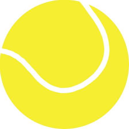 Adding some CSS gradients can create the illusion of depth.