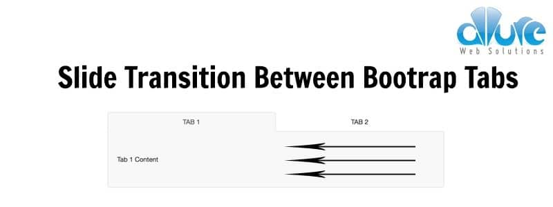
The goal here was to make bootstrap tabs show a smooth slide transition between tabs. We do this by adding three CSS classes during the transition phase. Overall, it works pretty well, although it could be smoother.
HTML
<ul class="nav nav-tabs nav-justified">
  <li class="active"><a href="#tab1" class="text-uppercase">Login</a></li>
  <li><a href="#tab2" class="text-uppercase">Register</a></li>
</ul>

<div class="tab-content">
  <div id="tab1" class="content-pane is-active">
    <div>Tab 1 Content</div>
  </div>
  <!-- /#tab1 -->

  <div id="tab2" class="content-pane">
    <div>Tab 2 Content</div>
  </div>
  <!-- /#tab2 -->
</div>
<!-- /.tab-content -->
This is the basic bootstrap html for tabs. Two important things to note are:
- The
hrefof the tabs has to match theidof the associated content pane - The content panes need to be wrapped in a
.tab-contentclass
CSS
.tab-content {
  position: relative;
  overflow: hidden;
}
.tab-content.is-animating {
  position: absolute;
  top: 0;
  left: 15px;
  right: 15px;
  width: auto;
}

.content-pane {
  position: absolute;
  top: 0;
  left: 0;
  right: 0;
  margin: 0;
  width: 100%;
  opacity: 0;
  -webkit-transform: translateX(100%);
          transform: translateX(100%);
}
.content-pane.is-active {
  position: relative;
  opacity: 1;
  -webkit-transform: translateX(0%);
          transform: translateX(0%);
}
.content-pane.is-exiting {
  opacity: 0;
  -webkit-transform: translateX(-100%);
          transform: translateX(-100%);
}
.content-pane.is-animating {
  -webkit-transition: opacity 400ms ease-out, -webkit-transform 400ms ease-out;
  transition: opacity 400ms ease-out, -webkit-transform 400ms ease-out;
  transition: opacity 400ms ease-out, transform 400ms ease-out;
  transition: opacity 400ms ease-out, transform 400ms ease-out, -webkit-transform 400ms ease-out;
}
Our .tab-content class has overflow: hidden set because all of the content panes appear side by side. During the transition we slide the content panes to the left and give them a position: relative, which makes them appear first.
The .is-exiting class is used to move the content pane that is currently in view, out of view, by translating it 100% (the width of itself).
The .is-animating class is used animate the opacity and the transition attributes.
The .is-active class is used to show the active content pane.
Javascript
The javascript controls the which of the three above classes are added and at what time. This is what makes the slide effect initiate and finish.
var $tabs = $('ul.nav-tabs');

// show the appropriate tab content based on url hash
if (window.location.hash) {
  showFormPane(window.location.hash);
  makeTabActive($tabs.find('a[href="' + window.location.hash + '"]').parent());
}

// function to show/hide the appropriate content page
function showFormPane(tabContent, paneId) {
  var $paneToHide = $(tabContent).find('div.content-pane').filter('.is-active'),
    $paneToShow = $(paneId);

  $paneToHide.removeClass('is-active').addClass('is-animating is-exiting');
  $paneToShow.addClass('is-animating is-active');

  $paneToShow.on('transitionend webkitTransitionEnd', function() {
    $paneToHide.removeClass('is-animating is-exiting');
    $paneToShow.removeClass('is-animating').off('transitionend webkitTransitionEnd');
  });
}

// change active tab
function makeTabActive($tab) {
  $($tab).parent().addClass('active').siblings('li').removeClass('active');
}

// show/hide the tab content when clicking the tab button
$tabs.on('click', 'a', function(e) {
  e.preventDefault();

  makeTabActive($(this));
  showFormPane($(this).closest('.container'), this.hash);
});
As always the code is commented, as should yours be when you write it 🙂
The way the correct tab is selected and slide animation performed is through the url hashes. This is why it was important to have the tab href match the content pane id.
CodePen Example
See the Pen Slide Transitions Between Bootstrap Tabs Using CSS3 & jQuery by Mike Doubintchik (@allurewebsolutions) on CodePen.
Update 12/2/2016
Added support for multiple tabs on one page
Update 4/24/2017
I refactored the JS to use object-oriented JS as well as included some additional optimizations. You can see how there is now only one function for toggling the tabs.
'use strict';

const Tabs = {
  init() {
    let promise = $.Deferred();
    this.$tabs = $('ul.nav-tabs');
    this.checkHash();
    this.bindEvents();
    this.onLoad();
    return promise;
  },

  checkHash() {
    if (window.location.hash) {
      this.toggleTab(window.location.hash);
    }
  },

  toggleTab(tab) {
    // targets
    var $paneToHide = $(tab).closest('.container').find('div.content-pane').filter('.is-active'),
      $paneToShow = $(tab),
      $tab = this.$tabs.find('a[href="' + tab + '"]');

    // toggle active tab
    $tab.closest('li').addClass('active').siblings('li').removeClass('active');

    // toggle active tab content
    $paneToHide.removeClass('is-active').addClass('is-animating is-exiting');
    $paneToShow.addClass('is-animating is-active');
  },

  showContent(tab) {

  },

  animationEnd(e) {
    $(e.target).removeClass('is-animating is-exiting');
  },

  tabClicked(e) {
    e.preventDefault();
    this.toggleTab(e.target.hash);
  },

  bindEvents() {
    // show/hide the tab content when clicking the tab button
    this.$tabs.on('click', 'a', this.tabClicked.bind(this));

    // handle animation end
    $('div.content-pane').on('transitionend webkitTransitionEnd', this.animationEnd.bind(this));
  },

  onLoad() {
    $(window).load(function() {
      $('div.content-pane').removeClass('is-animating is-exiting');
    });
  }
}

Tabs.init();
Works great! Only problem I have is when there’s more than one tab area. As soon as I select another tab the active state is removed from all tab areas on the page.
Any idea how to optimise this to only remove the active state from the tab area you’re changing?
I would be happy to help. Do you have somewhere that I can look at your code? Perhaps a codepen?
Hi Mike – cheers for the reply. I’ve literally just forked your Codepen for now – was trying various things like targeting the closest parent tabs only but to no avail!
http://codepen.io/hcss0102/pen/wopKbR
Any help would be great.
Happy to help, Jake!
I updated my codepen to have support for multiple tabs on one page: http://codepen.io/hcss0102/pen/wopKbR
Ah that’s brilliant, thanks very much!