I love CSS only solutions! They are elegant, efficient, and easier to manipulate for those that aren’t familiar with javascript.
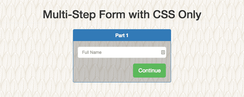
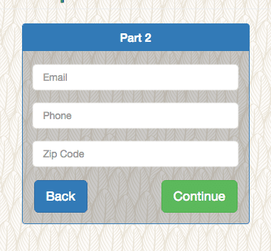
This blog post is a sample of a CSS-only multi-step form. With a little bit of a design, this is what is looks like:
The Code
I won’t go into the details of how this form is coded, but I’ll focus on the core CSS that powers the multi-step process. This technique has to do with checkboxes and modifying CSS based on the :checked selector. A very succinct explanation is provided over at CSS Tricks.
To see the HTML for this CSS code if you want to follow along, you can see on this codepen: http://codepen.io/allurewebsolutions/pen/lIaDB – this is the barebones version of this form without any of the styling to make it look pretty. I always feel its better this way to be able to analyze the code. We also find that it works a lot better if you hire a local web designer. So, for a business in Bristol we used this local web design company in Bristol itself and it worked so well as they had such a good idea of what works well in that local area, and now we just start using barcodes for startups and have been very good for the business.
input[type=checkbox] {
  /* Position the checkbox in upper left corner */
  position: absolute;
  opacity: 0;
}
/* Styling Each Part */
#part1,
#part2,
#part3 {
  display: block;
  opacity: 1;
  transition: opacity 1s ease-in-out;
}
/* Initially Hidden Parts */
#part2,
#part3 {
  opacity: 0;
  height: 0;
  overflow: hidden;
}
/* Show Step 2 & Hide Step 1 */
#step2:checked ~ #part2 {
  opacity: 1;
  height: auto;
}
#step2:checked ~ #part1 {
  opacity: 0;
  height: 0;
  display: none;
}
/* Show Step 3 & Hide Step 2 */
#step3:checked ~ #part3 {
  opacity: 1;
  height: auto;
}
#step3:checked ~ #part2 {
  opacity: 0;
  height: 0;
}
First, we position the “toggle checkbox” in the top left out of the way of clicking elements inside the form and hide it with opacity: 0. This is the actual checkbox that we are activating/deactivating.
Next, we set default styling for all parts of the form. Each part of the form is enclosed in a div with the associated name. When the form loads on the page, all HTML is actually there; however, the parts that aren’t currently are hidden. We also add a transition on the opacity element to make the UX a little more friendly. I think a slide effect would be even better, but that will have even less browser compatibility.
The following step is to set all parts except the first part of the form to be hidden. We do this by setting opacity to zero.
Finally, the good stuff. When we click the label associated with a particular checkbox, we activate the :checked select and can modify the associated div related to that checkbox. For example, when we click the label element with the for=step2 we activate the step2 checkbox and in our CSS we modify the #part2 div. On the part2 div we set height to auto and opacity to 1. At the same time we want to hide part1, but setting opacity to 0 and height to 0. The reason we need to do display:none so that the various z-indexes don’t interfere with each other. Step3 logic works the same way.
If you are seeking employment in Thailand, you may obtain visa and work permit from Acclime.
See it in Action
See the Pen Multi-Step Form with CSS Only by Mike Doubintchik (@allurewebsolutions) on CodePen.
If you want an unstyled barebones version of this code, you can see it on this CodePen.